The history of Psmith Journalist is a little more complicated than might be anticipated. It was first published in volume form in 1915. However, it was originally serialised in the boys' paper The Captain as far back as 1909-10. I don't know why it took so long to achieve separate publication. It's a strong book, very different from what we might expect from PGW in that it deals relatively seriously and factually with the gangs of early 20th century New York - though it is true that this basic setup is farcically disrupted by the intervention of the unruffleable Psmith.
As I've mentioned before, Ionicus seemed to take especial pleasure in the Psmith covers. Here, the shabby offices of the paper Cosy Moments are beautifully evoked, with a glimpse of old New York visible through the window. Psmith is immaculate as ever, but, leaning against a filing cabinet, seems completely at home - as he is in every place. Behind the desk is the firebrand editor Billy Windsor, and on the other side is a certain Francis Parker, a sleek and immaculate young man who is however the mouthpiece for much nastier forces. This is a very carefully composed cover, in the balance of figures, the colours, and the detail in every corner of it. One of the very best. This title was first published in Penguin in 1970, and I would say the Ionicus cover dates from then.
Here's the first page of the book - Wodehouse's Preface in which he assures readers that the events described have a strong basis in reality. The font is Intertype Times, and the book was printed, appropriately enough, in the USA - Harrisonburg, Virginia.
The tale concerns an inoffensive little journal for the home, called Cosy Moments. When the editor goes off on holiday for the good of his health, it is left in the hands of an ambitious and frustrated young man from Wyoming, Billy Windsor. With Psmith's encouragement, he turns the paper into a sensational and crusading anti-corruption sheet.
For the most part, Psmith treats the whole thing as a game. However, there is one aspect which he treats very seriously. In one episode, he stumbles upon a thoroughfare called Pleasant Street, a place of horrific slum tenements. Having investigated what they are like, Psmith decides as follows:
"I propose... to make things as warm for the owner of this place as I jolly well know how. What he wants, of course... is disembowelling. I fancy, however, that a mawkishly sentimental legislature will prevent our performing that national service. We must endeavour to do what we can by means of kindly criticisms in the paper."
It is this crusade which leads to attacks on the paper by the gangs of New York. After some digging they discover that the owner of the tenements is as certain Stewart Waring, "one of the biggest men in New York", who happens to be running for the post of City Alderman. Waring had previously been Commissioner of Buildings, but had to resign when a music hall built under his watch collapsed on the third night due to its poor construction, "killing half the audience." That was five years ago, however, and it has since been put about that he is a reformed character. "The other papers said it was a shame, hounding a man who was sorry for the past and who was trying to make good now.... He's been shooting off a lot of hot air lately abut philanthropy and so on. Not that he has actually done a thing - not so much as given a supper to a dozen news-boys; but he's talked, and talk gets over if you keep it up long enough."
Anyway, finally the man Waring is against the ropes, worsted, of course, by the fiery Billy Windsor and the debonair Psmith. They have the proof that could break him. What, Waring asks, will they do? Psmith replies:
"The right plan would be to put the complete kybosh (if I may use the expression) on your chances of becoming an alderman. On the other hand, I have been studying the papers of late, and it seems to me that it doesn't much matter who gets elected. Of course the opposition papers may have allowed their zeal to run away with them, but even assuming that to be the case, the other candidates appear to be a pretty fair consignment of blighters. If I were a native of New York, perhaps I might take a more fervid interest in the matter, but as I am merely passing through your beautiful little city, it doesn't seem to me to make any very substantial difference who gets in. To be absolutely candid... If the People are chumps enough to elect you, then they deserve you."
So he allows Waring to run for Alderman without exposing his nastiness; but Psmith does insist that Pleasant Street is renovated completely and made fit for human habitation. A practical solution, and studiously unpolitical in the narrow sense of the word.
For Wodehouse, this is almost angry; very nearly a serious political statement. I can't immediately think of another instance. For that alone, mark it well.
Sunday, 15 January 2017
Monday, 2 January 2017
Pearls, Girls and Monty Bodkin
I will admit frankly that the only reason I'm choosing to feature this book at this time is that the cover seems so appropriate to the festive season. Pearls, Girls and Monty Bodkin is late period Wodehouse, first published in 1972 when he was over ninety years old. It forms the third part of what one might loosely call the Monty Bodkin Trilogy, the other two books being Heavy Weather (1933) and The Luck of the Bodkins (1935).
It's difficult to think what might have spurred PGW to continue this saga in the 1970s after such a long hiatus. Clearly, he felt the story had not been satisfactorily concluded in the previous instalment. As happened in the cases of other long-running sagas (the Fink-Nottle/Bassett romance springs to mind) he took a late decision to change the formula. Here, Monty Bodkin, long-term beau of the formidable Gertrude Butterwick, changes his mind. The way to happiness is complicated by the requirement to keep in the good books of dim but temperamental Hollywood mogul Ivor Llewellyn. In my memory, it was a not-so-good tale; but I was pleasantly surprised by it upon rereading it a few months ago. In these last novels, Wodehouse seems to relax a little. He is not so worried about plot, and the style is not so strenuous. (In the 1960s especially, the zest seemed to go out of Wodehouse, and he tried to replace it with unflagging busyness.) This novel is only 170 pages long, and its successors were even shorter.
It is set in Linotype Times. Here we go:
This edition was first published by Penguin in 1974, only two years after the first edition. The Ionicus cover dates from this time, too. I think it is one of his very best. The atmosphere of the nightclub is conveyed wonderfully (it looks much more fun than any actual nightclub could ever have been): Llewellyn dancing enthusiastically with the rather Grace-Kelly-ish heroine Sandy Miller while Monty Bodkin looks on, despondently. Get those reds and yellows! It's been mentioned to me that Ionicus's figures could be rather lifeless (and I agree), but surely that criticism couldn't be levelled here.
Sunday, 13 November 2016
The Immortal World of P.G. Wodehouse
I have this recurring dream.
I'm about fourteen years old again, and I'm in a bookshop, browsing through its extensive collection of Wodehouse titles. And I find a title I haven't seen before, have never even heard of. It has, of course, an Ionicus cover. It's a moment of immense rapture and excitement.
I look at the title, and I know it's a brilliant title, even though when I try to concentrate on it and memorise it, it turns into a jumble of nonsense. Just as, when I open the book and I try to make sense of the opening words (which I know are superb) they also dissolve and become random letters.
I don't think that in my dream I ever manage to get the book to the payment counter.
That moment of finding a new Wodehouse or a new Ionicus cover, which I really did experience often at that stage in my life, in the early to mid-1980s, has remained with me as a pure and genuine peak of my existence. I suppose that's an indictment of my eventless life; but so it goes.
That's another reason why I started this blog. Having found the "Life At Blandings" box set, I wanted to share it.
More recently, I found and acquired another box set, apparently dating from about 1973 to judge from the printing date of the books inside. It's called "The Immortal World of P.G. Wodehouse", but really it's a Jeeves and Bertie Wooster set....
As I've mentioned before, Jeeves and Bertie change appearance radically throughout the Ionicus series. Here, Jeeves in particular is something of a disappointment: too nondescript, seemingly your standard non-speaking-role manservant. Still, this series of pictures has a real charm, I think, and gives a valuable peep into Bertie's behind the scenes existence, between the books as it were.
Oh, and which books are in the set, you ask? These:
I'm about fourteen years old again, and I'm in a bookshop, browsing through its extensive collection of Wodehouse titles. And I find a title I haven't seen before, have never even heard of. It has, of course, an Ionicus cover. It's a moment of immense rapture and excitement.
I look at the title, and I know it's a brilliant title, even though when I try to concentrate on it and memorise it, it turns into a jumble of nonsense. Just as, when I open the book and I try to make sense of the opening words (which I know are superb) they also dissolve and become random letters.
I don't think that in my dream I ever manage to get the book to the payment counter.
That moment of finding a new Wodehouse or a new Ionicus cover, which I really did experience often at that stage in my life, in the early to mid-1980s, has remained with me as a pure and genuine peak of my existence. I suppose that's an indictment of my eventless life; but so it goes.
That's another reason why I started this blog. Having found the "Life At Blandings" box set, I wanted to share it.
More recently, I found and acquired another box set, apparently dating from about 1973 to judge from the printing date of the books inside. It's called "The Immortal World of P.G. Wodehouse", but really it's a Jeeves and Bertie Wooster set....
This is the front illustration: Bertie caught en dishabille prior to his morning tea, and not in the best of moods. The picture on the spine shows him washed and brushed and almost ready to sally forth:
.... while the one on the back of the box shows him setting out, Jeeves having done all he can to ensure he is spruce and immaculate:
As you can see, the box set has had a rough time of it in the past forty years or so, and has become faded and blotchy. But I think and hope we can forgive it.
As I've mentioned before, Jeeves and Bertie change appearance radically throughout the Ionicus series. Here, Jeeves in particular is something of a disappointment: too nondescript, seemingly your standard non-speaking-role manservant. Still, this series of pictures has a real charm, I think, and gives a valuable peep into Bertie's behind the scenes existence, between the books as it were.
Oh, and which books are in the set, you ask? These:
Sunday, 30 October 2016
Big Money
Wodehouse's novels are variable in quality. None fall below a fairly high bar; but it must be admitted not all achieve the intoxicating brilliance of Right Ho, Jeeves. I do find that some of them, though using every comic device he knew, leave me thinking, as Wodehouse himself did on rereading one of his books, "Fairly good, I think, but what does it prove?" In my mind, I classed Big Money (1931) as one of these "what does it prove?" titles - until I re-read it.
It's a non-series novel, featuring dud mine shares which turn out to be worth a fortune, financiers, conmen, and aristocrats on their uppers. The main situation is rather interesting: two old school pals, Berry Conway and Lord Biskerton ("the Biscuit"). Berry has no money and holds down a job as secretary to mogul T. Paterson Frisby to pay back a moral debt. The Biscuit is also penniless but is content to scrounge a living as best he can, getting a job being of course out of the question. Both characters are likeable and there is no disapproval expressed towards the Biscuit for his frankly amoral attitude. And both characters are equally willing to flog dud shares to a mug for profit, when the opportunity arises.
Money is seen as morally neutral. Anything can be done to gain it; its worth is entirely practical.
The book has a feel of being unusually close to reality. (Of course, in Wodehouse this is a very relative concept.) The London portrayed is not quite the usual fantasy land. It portrays not a Bertie Wooster effortlessly living on untold and unmentioned riches, but a noble family scraping a living by ignoble means in ways not very far from what must have been often the case at the time. The plot itself is nonsense, of course; but the journey is a lot of fun.
Here's the Ionicus cover:
The scene shows a country inn, where the Biscuit, in disguise to escape his creditors, has his false beard pulled off by the barmaid just as Berry walks in. The barmaid is described as "a robust lady in black satin with... a large brooch athwart her bosom with the word 'Baby' written across it in silver letters", but Ionicus has exercised artistic licence on this occasion, probably to get the colour balance right. As always, the décor is faultless. This is one of the covers that recall fond memories of reading Wodehouse in the 1980s; I would stare at a cover like this and drink the atmosphere intensely.
The text is in Linotype Times and it looks like this:
It's a non-series novel, featuring dud mine shares which turn out to be worth a fortune, financiers, conmen, and aristocrats on their uppers. The main situation is rather interesting: two old school pals, Berry Conway and Lord Biskerton ("the Biscuit"). Berry has no money and holds down a job as secretary to mogul T. Paterson Frisby to pay back a moral debt. The Biscuit is also penniless but is content to scrounge a living as best he can, getting a job being of course out of the question. Both characters are likeable and there is no disapproval expressed towards the Biscuit for his frankly amoral attitude. And both characters are equally willing to flog dud shares to a mug for profit, when the opportunity arises.
Money is seen as morally neutral. Anything can be done to gain it; its worth is entirely practical.
The book has a feel of being unusually close to reality. (Of course, in Wodehouse this is a very relative concept.) The London portrayed is not quite the usual fantasy land. It portrays not a Bertie Wooster effortlessly living on untold and unmentioned riches, but a noble family scraping a living by ignoble means in ways not very far from what must have been often the case at the time. The plot itself is nonsense, of course; but the journey is a lot of fun.
Here's the Ionicus cover:
The scene shows a country inn, where the Biscuit, in disguise to escape his creditors, has his false beard pulled off by the barmaid just as Berry walks in. The barmaid is described as "a robust lady in black satin with... a large brooch athwart her bosom with the word 'Baby' written across it in silver letters", but Ionicus has exercised artistic licence on this occasion, probably to get the colour balance right. As always, the décor is faultless. This is one of the covers that recall fond memories of reading Wodehouse in the 1980s; I would stare at a cover like this and drink the atmosphere intensely.
The text is in Linotype Times and it looks like this:
It is a low key beginning to a tale very much worth reading.
Saturday, 17 September 2016
The Mating Season
From the information on the reverse side of the title page, this seems to have been created by Ionicus in 1971. It's very unusual in his work from this time in being, not a depiction of events in carefully drafted settings, but character studies floating in space. The characters are well delineated (we are given Ionicus's only depiction of Gussie Fink-Nottle, and the only criticism I might make is that it is too much like Gussie Fink-Nottle to be entirely pleasant), and we have an excellent Bertie and Jeeves in the middle.
There is however one point I'd like to raise in this connection. Ionicus, at his best, was an excellent depicter of character; but what he could not do, seemeingly, was consistently show a character over a series of images. I would ask the reader to glance again at the covers of Carry On, Jeeves, Jeeves in the Offing and Much Obliged, Jeeves. Each has its charm and its virtues, especially the first two, and each is a carefully considered depiction of Jeeves and Bertie. But the Bertie of Carry On, Jeeves has dark, mousy hair; in Much Obliged, Jeeves it is grey; and here in The Mating Season it is coppery brown. The Jeeves of Carry On, Jeeves is quite simply different from the Jeeves of Much Obliged, Jeeves, and both are different from the Jeeves of The Mating Season. They even have differently shaped heads. The same strictures could be made about Ionicus's depictions of Lord Emsworth, the Hon Galahad Threepwood, and some others. It did worry me slightly, in the way that matters that are of no importance whatsoever can worry a person. But now I know how to think about the matter, and I am at peace. What we have over these series is the characters of Jeeves, Bertie and the others, all excellently depicted, only by different actors.
The type is Monotype Bembo: a little different from most of the others, larger and easier to read:
There is however one point I'd like to raise in this connection. Ionicus, at his best, was an excellent depicter of character; but what he could not do, seemeingly, was consistently show a character over a series of images. I would ask the reader to glance again at the covers of Carry On, Jeeves, Jeeves in the Offing and Much Obliged, Jeeves. Each has its charm and its virtues, especially the first two, and each is a carefully considered depiction of Jeeves and Bertie. But the Bertie of Carry On, Jeeves has dark, mousy hair; in Much Obliged, Jeeves it is grey; and here in The Mating Season it is coppery brown. The Jeeves of Carry On, Jeeves is quite simply different from the Jeeves of Much Obliged, Jeeves, and both are different from the Jeeves of The Mating Season. They even have differently shaped heads. The same strictures could be made about Ionicus's depictions of Lord Emsworth, the Hon Galahad Threepwood, and some others. It did worry me slightly, in the way that matters that are of no importance whatsoever can worry a person. But now I know how to think about the matter, and I am at peace. What we have over these series is the characters of Jeeves, Bertie and the others, all excellently depicted, only by different actors.
The type is Monotype Bembo: a little different from most of the others, larger and easier to read:
I have very fond memories of my first encounter with this novel, at about the age of fourteen. I had devoured the "classic" Jeeveses: the short stories, plus Right Ho, Jeeves and The Code of the Woosters (named by my father as the true classics, as of course they are); I had also read Jeeves and the Feudal Spirit (1954), a later and inferior title in the series; but The Mating Season (1949), which I now consider the last of the first-rank Jeeves novels (not counting the sweet swan-song, Aunts Aren't Gentlemen (1974)), was a quite new discovery to me, the title's existence becoming apparent at the same moment as the book itself manifested itself in the bookshop. It revisits some of the ideas from previous books (the Market Snodsbury Grammar School Prizegiving becomes the King's Deverill Village Concert; the Aberdeen terrier Bartholomew in The Code of the Woosters becomes the shaggy dog Sam Goldwyn; and so on), but it plays some excellent variations along the way. It also has a great, and unusual ending, with the promise of Bertie for once in his life facing up to the dread Aunt Agatha. (A very similar act of defiance occurs at the end of Uncle Dynamite (1948); was there a special importance for Wodehouse himself in this?) And Wodehouse also manages to wreak a petty but very satisfying revenge on A.A. Milne, who had heaped abuse on Wodehouse during the war years.
Sunday, 11 September 2016
Psmith in the City
I've put Ionicus's cover right at the top of this entry for one very good reason: it's absolutely gorgeous. Those dark greens and browns (the Wodehouse logo just the right shade of green to match); the two main figures (foppish Psmith on the left; his friend the straight-down-the-line Mike Jackson on the right) in very characteristic attitudes; the as-ever perfectly captured décor so exactly right that one can almost smell the ink. The title first appeared in Penguin in 1970, so it appears to be one of Ionicus's very first Wodehouse designs.
Psmith (the P is silent, "cp. the name Zbysco, in which the Z is given a similar miss-in-baulk", as Psmith helpfully explains in Mike) really shouldn't work as a character. When I think of him in the abstract, he is a kind of exemplar of privilege: deliberately affected in speech and vocabulary, insouciant, condescending, perpetually treating the world as if it were some childish game put on for his personal entertainment. Dash it all, the man even went to Eton!
But in practice the character is, I find, irresistible. His manner has been cultivated to cause the maximum of irritation to those nominally above him - when we first meet him in Mike (1909) that means schoolmasters; and here, in Mike's sequel Psmith in the City (1910) it means his employers in that renowned establishment the New Asiatic Bank. As Wodehouse himself had been employed as a clerk at the Hong Kong and Shanghai Bank from 1900 to 1902, we don't have to go far to see where he found his material for this funny and perceptive but in parts even slightly bitter novel. It feels, on the whole, like Wodehouse's revenge on his former employers, an account of his experiences, transmuted by the addition of the one character who could be counted on to give better than he got in any situation.
The novel's supposed hero is Mike Jackson, the real Wodehouse substitute, a brilliant cricketer but otherwise honourable, slightly slow-witted and even a little humourless. It is taken for granted that working in a bank is the last thing any self-respecting soul would want to do. Escape is the goal, and in Mike's case the alternative is cricket as a profession. Almost any means is permissible: tricking, cheating, lying, and generally running rings round the stolid respectable managers who stand in our heroes' way. In these days it all seems rather daringly subversive.
The text is set in Intertype Times. Less flamboyant than, say, Monotype Garamond, its restraint somehow seems to fit with the repressive atmosphere of the book's locale:
Ionicus's covers for the Psmith novels are consistently good: atmospheric, elegant, and with a real care for artistic effect unfortunately lacking in a handful of other covers. I have the impression that Ionicus had an especial liking for Psmith; it's a great pity that he never did Mike and Psmith (the second half of Mike) which appeared in Penguin a few years later with a truly dreadful cover by another artist.
As I also have a later (1984) reprint of Psmith in the City, still with the Ionicus picture but using the revised cover design, I include this below. I very strongly hold that the later design is inferior: not as well balanced in the placement of author and title, clunky in typography, and with the picture placed just a little bit too high. Well, never mind. I can see that this title is one of the rare ones that has escaped the ghastly designs of the Millennium Penguin editions and the current Arrow versions. Let us be grateful therefore for small mercies.
Saturday, 3 September 2016
Meet Mr Mulliner / Mulliner Nights
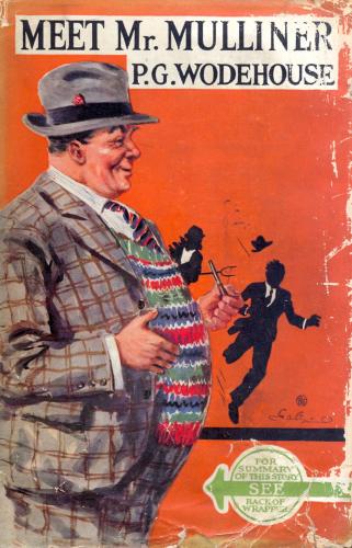
Wodehouse wrote to his friend William Townend on 30 June 1945: "God may have forgiven Herbert Jenkins for the jacket to Meet Mr Mulliner, but I never shall." (quoted in Robert McCrum, Wodehouse: a Life [Penguin, 2005], page 352)
This is the first edition cover of Meet Mr Mulliner (1927), the image that fired his wrath (image stolen from the Internet):
Well, there's one obvious feature which might easily have made him wince: the arrow pointing directly at Mr Mulliner's groin shows, at the very least, a lack of concern in detail. But I'd also argue that the general principle of portraying Mr Mulliner as a hearty, hail-fellow-well-met sort of a geezer with a revoltingly jovial manner was off the mark.
This is the start of the first Mulliner story, in which the narrator of these tall tales is introduced (and let me mention in passing, in case I forget later on, that the type in this Penguin edition is Monotype Garamond):
I will frankly admit there is nothing in this description which directly contradicts the picture of the ghastly outsider portrayed on the Jenkins cover; but all the same, and especially bearing in mind the general impression of a man with a quiet but compelling manner which comes out through the stories, I picture Mr Mulliner in very different terms. Even the passage above contrasts his manner with that of the stereotypical boastful fisherman.
It may, of course, be that Ionicus's cover has coloured my view. It is, in my opinion, one of his very best. It appears to date from 1976. Here it is.
Here he is, then, a mild man of middle-age, dully respectable, just the man to tell the tallest tales in the world. The man seated on the right is just correct for the "I" who passes through the Angler's Rest to absorb the latest doings of the Mulliner clan. Ionicus, always at his best with furniture and other interior trappings, is in his element, and the mounted fish on the wall are an excellent touch. The colours are carefully chosen; the atmosphere of woody and rather fuggy cosiness can almost be smelt.
I've written previously about the importance of a good cover, and I don't want to labour the point. Wodehouse was one of the greats, and he deserved to be treated well. That is all.
There are three dedicated collections of Mulliner stories, but the second, Mr Mulliner Speaking, has never appeared in Penguin at all and so was never illustrated by Ionicus. Here, however, is the third, Mulliner Nights (1933), with a cover probably created in 1971;
As those familiar with the stories in this volume will realise, the scene portrayed is that of Adrian Mulliner, the detective, attempting to smile pleasantly at a Baronet, and only succeeding in creating an impression of sardonic superiority which prods the Bart's tender conscience, with startling consequences. The image is not as beautiful as that of Meet Mr Mulliner, but it has its points. Ionicus, it will be noticed by those comparing the different covers, varied the techniques used, and here he employs an unusual means to suggest the background figures at a wedding reception: a sort of sketchy watercolour method without his usual cartoon outlining, which keeps the figures out of focus so as to keep the viewer's attention on the foreground drama.
The Mulliner stories are not my absolute favourites from the Wodehouse oeuvre, but they have their charm.
This is the first edition cover of Meet Mr Mulliner (1927), the image that fired his wrath (image stolen from the Internet):
Well, there's one obvious feature which might easily have made him wince: the arrow pointing directly at Mr Mulliner's groin shows, at the very least, a lack of concern in detail. But I'd also argue that the general principle of portraying Mr Mulliner as a hearty, hail-fellow-well-met sort of a geezer with a revoltingly jovial manner was off the mark.
This is the start of the first Mulliner story, in which the narrator of these tall tales is introduced (and let me mention in passing, in case I forget later on, that the type in this Penguin edition is Monotype Garamond):
I will frankly admit there is nothing in this description which directly contradicts the picture of the ghastly outsider portrayed on the Jenkins cover; but all the same, and especially bearing in mind the general impression of a man with a quiet but compelling manner which comes out through the stories, I picture Mr Mulliner in very different terms. Even the passage above contrasts his manner with that of the stereotypical boastful fisherman.
It may, of course, be that Ionicus's cover has coloured my view. It is, in my opinion, one of his very best. It appears to date from 1976. Here it is.
Here he is, then, a mild man of middle-age, dully respectable, just the man to tell the tallest tales in the world. The man seated on the right is just correct for the "I" who passes through the Angler's Rest to absorb the latest doings of the Mulliner clan. Ionicus, always at his best with furniture and other interior trappings, is in his element, and the mounted fish on the wall are an excellent touch. The colours are carefully chosen; the atmosphere of woody and rather fuggy cosiness can almost be smelt.
I've written previously about the importance of a good cover, and I don't want to labour the point. Wodehouse was one of the greats, and he deserved to be treated well. That is all.
There are three dedicated collections of Mulliner stories, but the second, Mr Mulliner Speaking, has never appeared in Penguin at all and so was never illustrated by Ionicus. Here, however, is the third, Mulliner Nights (1933), with a cover probably created in 1971;
As those familiar with the stories in this volume will realise, the scene portrayed is that of Adrian Mulliner, the detective, attempting to smile pleasantly at a Baronet, and only succeeding in creating an impression of sardonic superiority which prods the Bart's tender conscience, with startling consequences. The image is not as beautiful as that of Meet Mr Mulliner, but it has its points. Ionicus, it will be noticed by those comparing the different covers, varied the techniques used, and here he employs an unusual means to suggest the background figures at a wedding reception: a sort of sketchy watercolour method without his usual cartoon outlining, which keeps the figures out of focus so as to keep the viewer's attention on the foreground drama.
The Mulliner stories are not my absolute favourites from the Wodehouse oeuvre, but they have their charm.
Subscribe to:
Posts (Atom)